Branding · 5 min read
Brand colors on merch: getting the match right
Screens lie and fabrics drink ink differently. Here's how Pantone matching, garment color, and print method work together to keep your brand color consistent from the website to the hoodie.
Nothing undermines a polished brand faster than a logo that's the wrong shade. The blue that looks crisp on your website can arrive muddy on a tote or washed-out on a tee — not because anyone made a mistake, but because screens, inks, and fabrics speak different color languages. The good news: color drift is predictable and controllable once you know what causes it.
Why your screen can't be trusted
Monitors emit light and mix color in RGB; physical printing reflects light and mixes in CMYK or with pre-mixed spot inks. The two gamuts don't fully overlap, so a vivid on-screen color may sit outside what ink can reproduce. On top of that, no two monitors are calibrated the same. That's why “match what's on my screen” isn't a spec a printer can reliably hit — the screen itself is the unreliable part.
Pantone (PMS) is the shared language
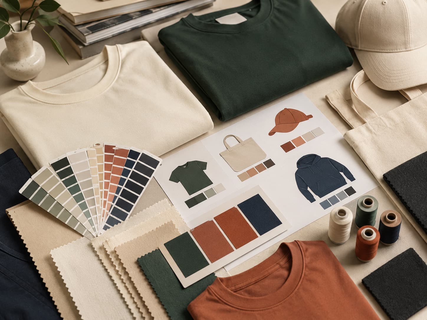
The fix is to specify color by a physical standard everyone can reference: the Pantone Matching System (PMS). A Pantone number (say, PMS 286 C) points to a pre-mixed ink with a known recipe, so your printer mixes to that exact color rather than guessing from a screenshot. If your brand guidelines list Pantone values, share them. If they don't, it's worth picking the closest Pantone to your primary colors once — then every future run, on every product, stays consistent.
Garment color changes everything
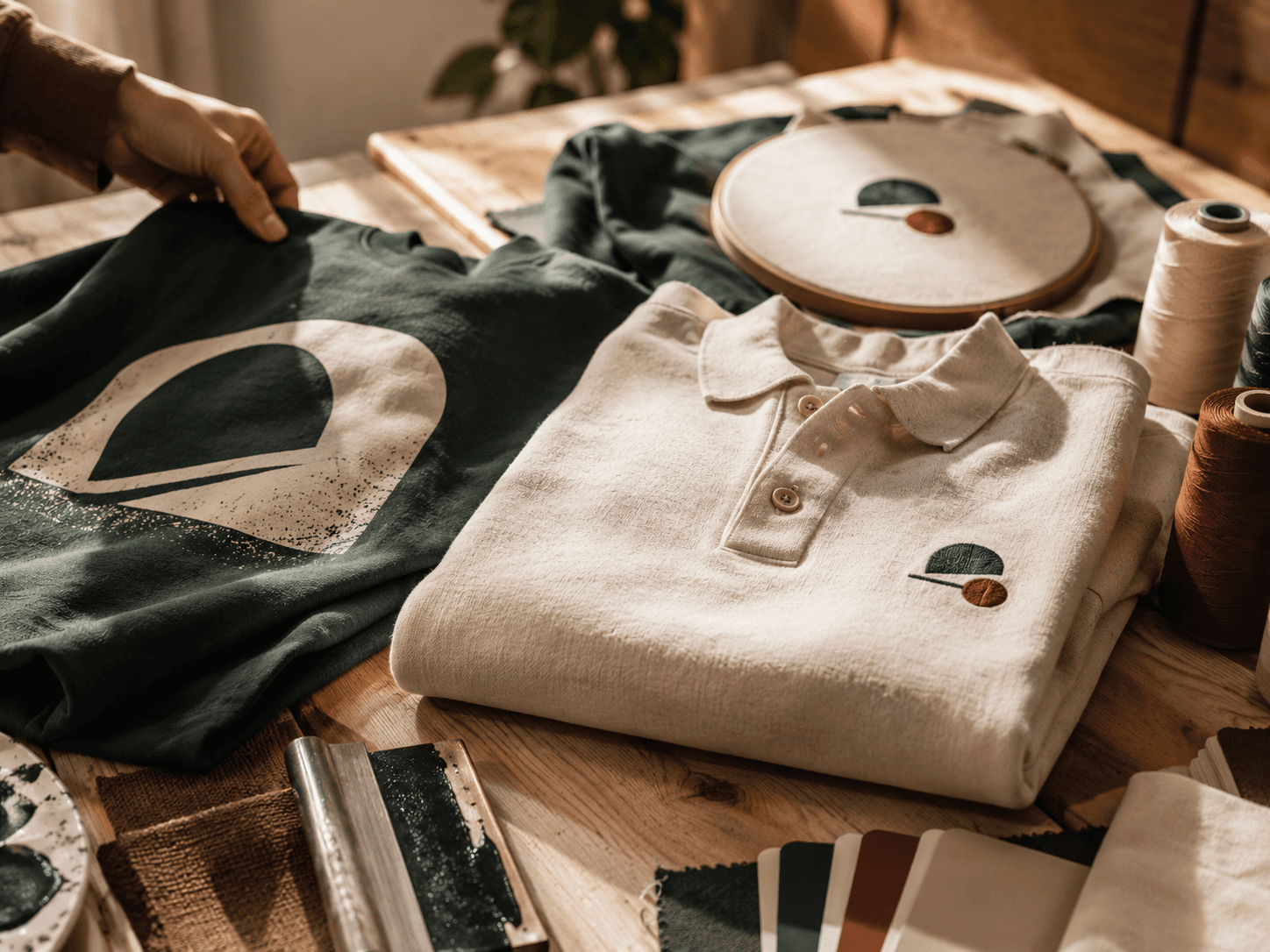
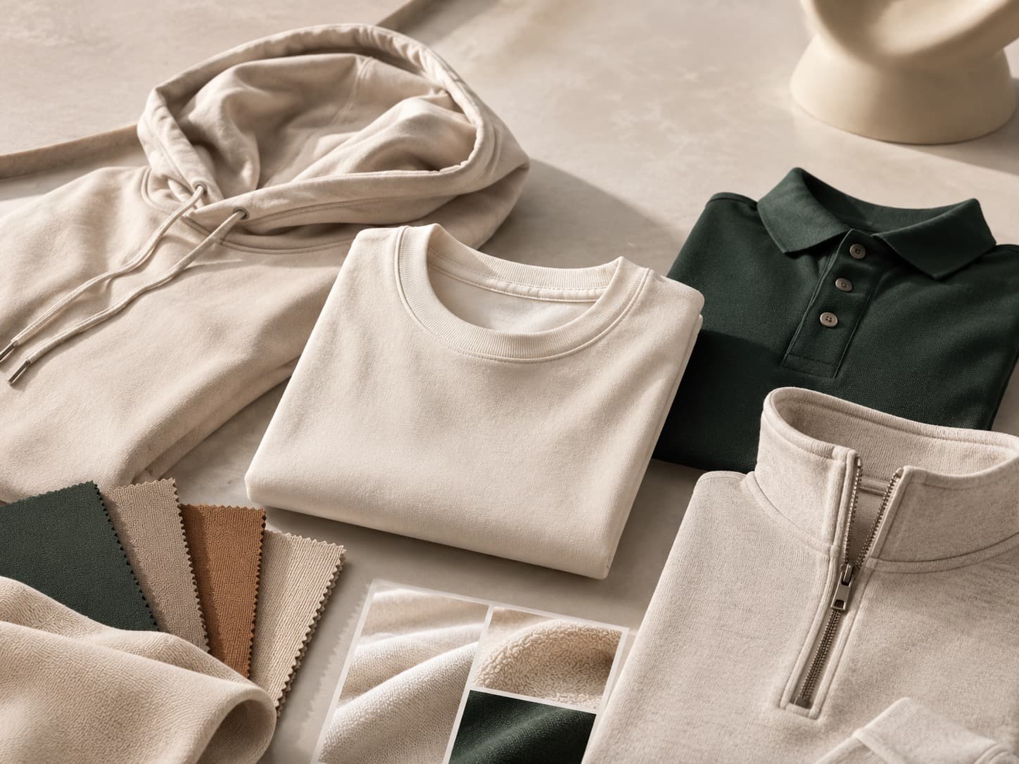
Ink is semi-transparent, so the color underneath shows through. The same yellow ink looks bright on a white tee and dull on a navy one. To hold a color on a dark garment, printers lay down a white underbase first — an extra step that keeps the color true. When you're choosing apparel colors, think about the contrast between your logo and the fabric: high contrast keeps a mark crisp, while a logo close to the garment color can vanish. Sometimes the smartest move is a one-color or reversed version of your logo for darker garments.
Print method and the fabric itself
How color lands also depends on method and material. Screen printing with spot inks gives the most accurate, vivid color match — the best choice when brand accuracy matters. Embroidery matches color by thread, so you choose from a thread library rather than a Pantone mix; it's close, not exact, and the texture shifts how the color reads. Fabric matters too: smooth, tightly-woven cotton holds color sharply, while textured or performance fabrics can absorb ink unevenly. On hard goods like a tumbler or tote, the substrate and coating affect the final shade as well.
How to protect your color across a run
- Specify Pantone, not a screenshot. Give PMS numbers wherever you can.
- Send vector artwork. AI, EPS, SVG, or PDF keeps edges and colors clean at any size.
- Plan for the garment color. Expect an underbase on darks; consider a reversed logo.
- Approve a mockup. Confirm color, placement, and method before production.
- Keep specs on file. Lock the Pantone and method so reorders match every time.
You can preview your logo on different garment colors before committing when you lay it out in the studio, and every order ships only after you approve a mockup of exactly how it looks. Have Pantone values or questions about matching? Request a free quote or call (737) 253-8727 and we'll make sure your brand color lands right.